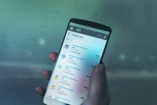
Those of you with a keen knowledge of Roman mythology will know Mercury was the god of financial gain, and travelers (among other things). This is really quite fitting given that today we unveil Chrome River MERCURY, which delivers a completely new experience in corporate expense management, making your travel smoother, and speeding up your expense processing.
MERCURY is designed specifically with the mobile worker in mind, and provides a fast, fluid and consistent experience for business travelers, regardless of whether they are on a smartphone, tablet, laptop or desktop computer. This fluidity explains the true reason why we decided to use the name MERCURY, and if you ever spilled any of the liquid metal in the chemistry lab, our rationale will make a lot of sense.
We’ve decided to take a mobile-centric approach for a number of reasons. The most obvious is that smartphones are ubiquitous, so the ability to capture and submit expenses where they are incurred is obvious. Second, 90% of people move between devices (smartphone, tablet, laptop, etc.) to perform a task, so the ability to seamlessly switch between devices without any data loss was essential.
What is it that makes MERCURY so different, and why does it provide such a great user experience for expense management? First, we’ve redesigned the look and feel of it from head to toe, so not only does it look sleek, but the functionality has been revamped, making it a much more streamlined and straightforward process for users to create expense reports.
Features like sophisticated OCR (optical character recognition) and a rules-based engine mean that you can simply take a photo of a receipt on your phone, email it into your report, and MERCURY will pull out details such as date, cost and vendor, so your expense reports practically write themselves.
Where MERCURY really shines, though, is in the way it’s delivered to you. First, it’s been built on HTML5 using Responsive Web Design, meaning that whatever device you use to access Chrome River, you will get the same look, feel and functionality. Simply open it in your browser and off you go. For end users, this means no more downloading an app to your phone, and then realizing that it looks and works nothing like your desktop app. For administrators, there’s no more training users on different devices or worrying about all users having the latest version of the app.
Another exciting development with MERCURY is the introduction of Single-Page Application (SPA) technology. With this architecture there are no page loads as the user moves through the application. Only tiny bits of data (JSON objects) are sent between the user’s device and the server. This ensures not only a smooth experience, but excellent performance even on slow network connections. Whether you are on the road, working at a hotel with a slow connection, or stuck on 3G, the SPA architecture is the key to a responsive experience.
We think that MERCURY is the fastest, richest and most intuitive travel expense management solution available and we’re excited to launch it today. If you’d like to see more, please check out the video overview or, to get more detail, read the fact sheet.
If you’re not yet a Chrome River customer and are interested in seeing MERCURY in action, click on the DEMO button at the top right of the screen, and we will arrange it for you. If you’re a current Chrome River user and want to move to MERCURY, please open a support ticket and we will be in touch to help you to make the move.
Subscribe
Latest Posts
Posts by Category
I just love the Chrome River application. I could probably sell it! Finance Administrative Coordinator Law Firm, 800 Employees
Can’t we just move year-end, so that we can roll out Chrome River sooner!? Financial Systems Director Law Firm, 300 Employees

Comments